Protegrity Branding Refresh
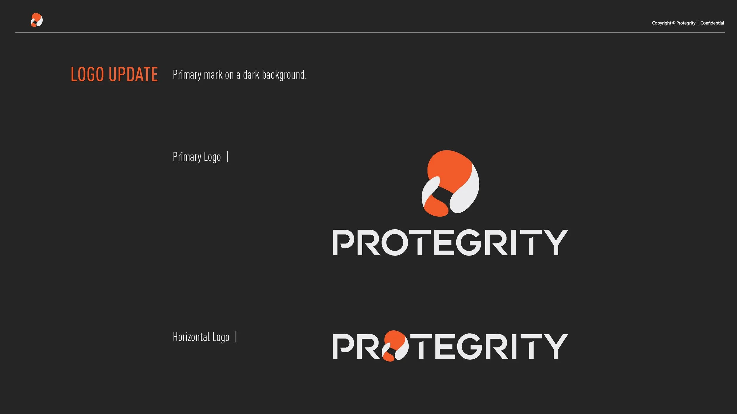
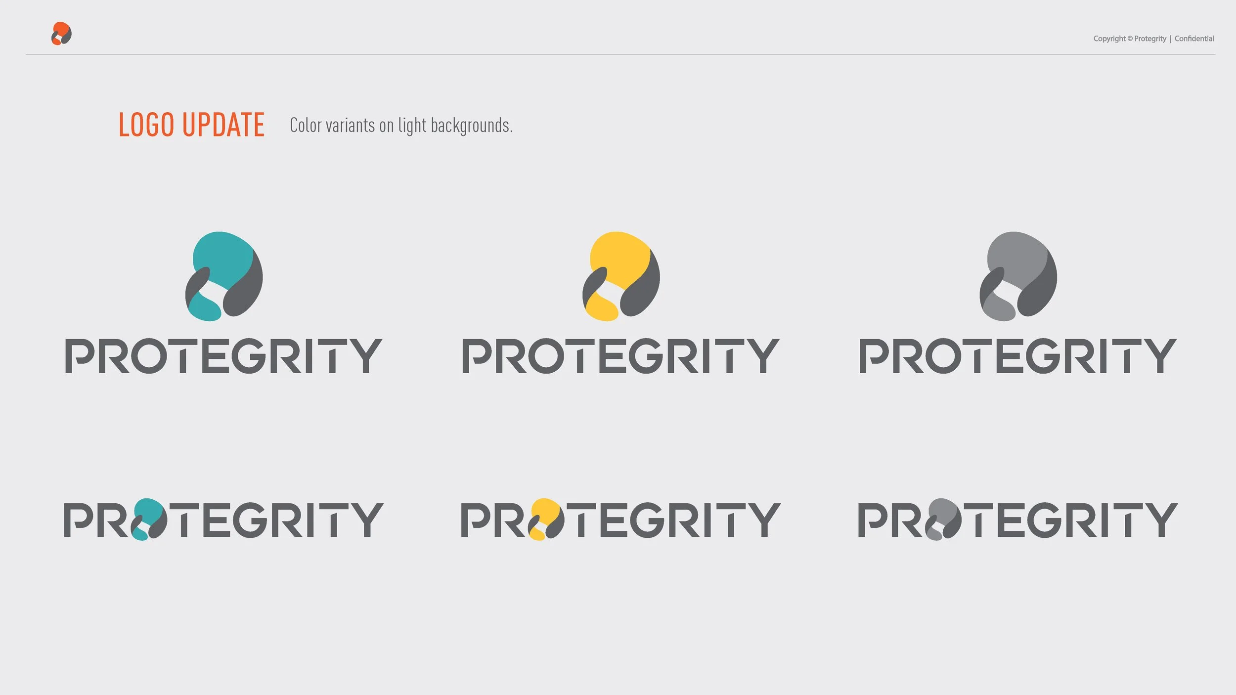
With a new website launch on the horizon, we saw an opportunity to refresh the Protegrity brand—incorporating audience research and feedback to better align with market expectations. Our goal was to refine the brand’s positioning and visual identity to instill trust and credibility, ensuring it resonated with businesses seeking a reliable data security partner.
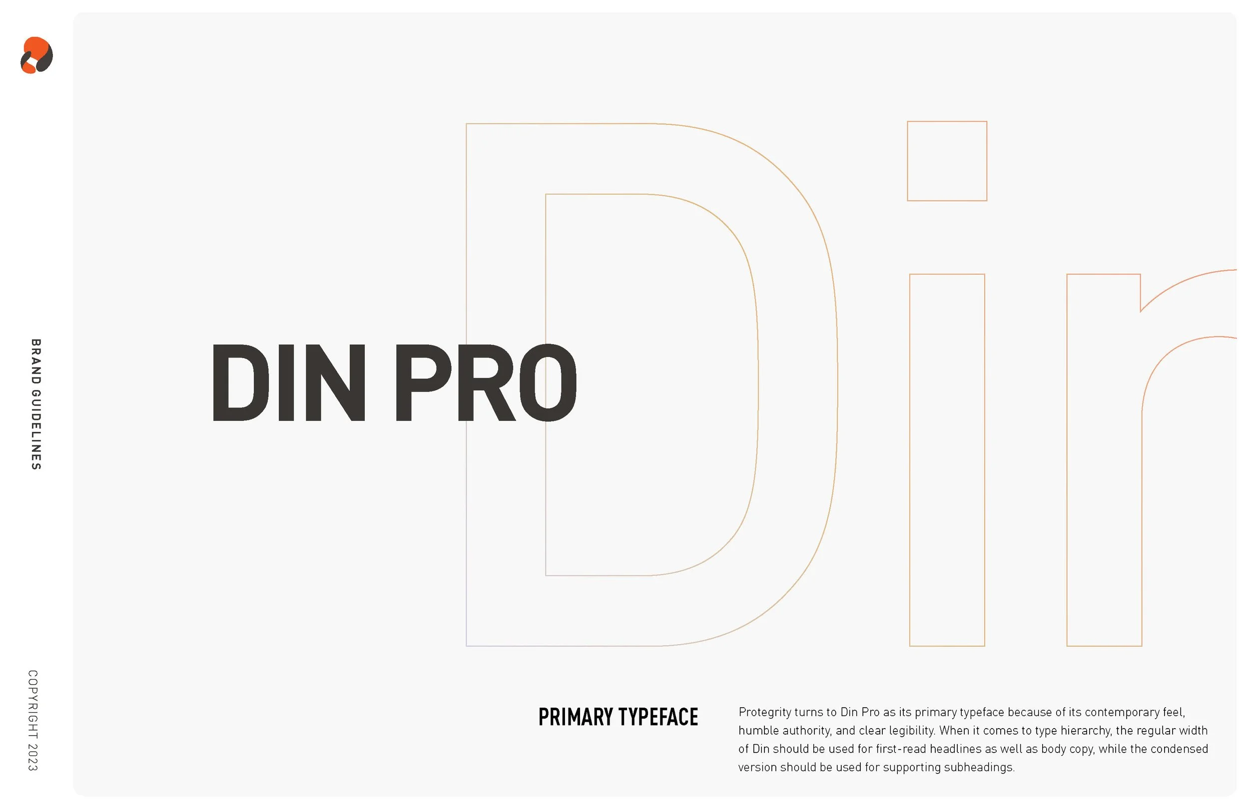
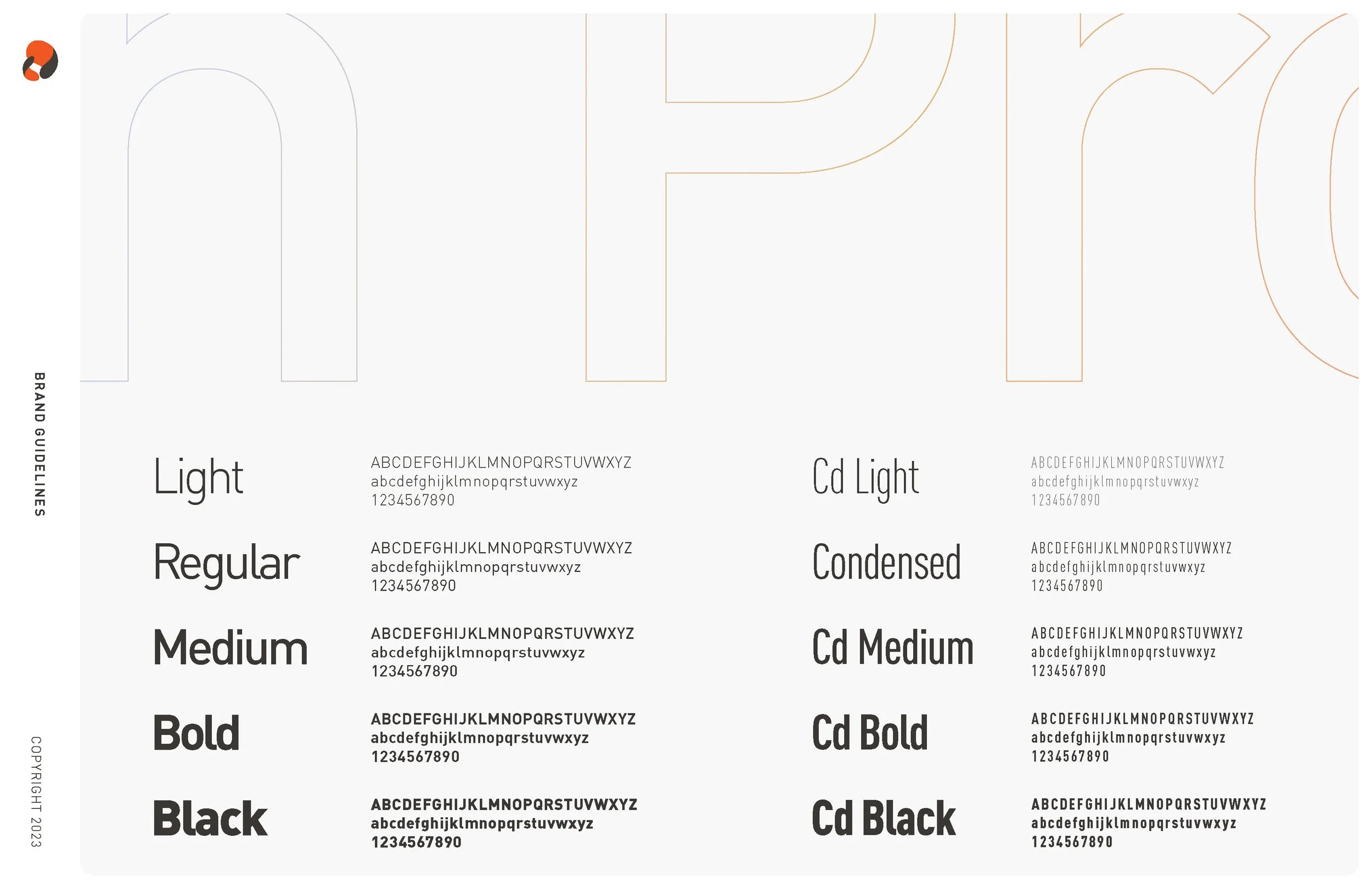
This update included a refined color palette, refreshed imagery, and a more intentional selection of symbols to enhance clarity and brand alignment. Additionally, I introduced a more professional and readable font choice, ensuring improved accessibility and a polished visual identity.







Campaign Creative Brief
With a new Demand Generation leader on board, we established a distinct visual style for each major campaign to create stronger brand consistency and impact.
To ensure cohesive execution across all touchpoints, I designed detailed campaign briefs, aligning the team on strategy, messaging, and creative direction. This approach streamlined collaboration and reinforced a unified brand experience across all marketing efforts.


Protegrity Branding Guidelines
When I joined Protegrity, we were building the marketing team from the ground up, giving me the opportunity to revitalize the brand after years of having no design team on board. I played a key role in establishing a cohesive visual identity, elevating the brand’s presence, and setting the foundation for a stronger creative direction.
I developed and elevated the Protegrity brand through in-depth market research and competitive analysis, positioning it uniquely within the industry. Focused on differentiating Protegrity from competitors to enhance brand perception and market presence.





Protegrity Brand Strategy
Led a brand strategy exercise to identify growth opportunities, culminating in a strategic pitch deck with key insights and recommendations. Designed to elevate brand perception, strengthen market position, and drive increased market share.


Brand Video for the Website
As part of Protegrity’s brand refresh and website relaunch, we developed a video to tell the Protegrity story—highlighting key achievements and reinforcing the brand’s credibility among top-tier clients.
I played a key role in shaping the video’s creative direction, selecting a location that offered both visual impact and a strong narrative connection. On-site, I directed the shoot, making key decisions on talent and storytelling to ensure the final piece aligned with the brand’s elevated positioning.
Community Forum Commercial
Protegrity launched the Shift Left community forum to bridge the communication gap between technical developers and security teams. To support this initiative, we developed a script that clearly articulated the problem and the solution Protegrity provided.
For continuity, we aligned the video’s style with our commercial series, ensuring a cohesive brand experience. This approach reinforced the forum’s value while maintaining a polished, custom video aesthetic that resonated with our audience.
Story Telling with Motion Graphics
To enhance technical storytelling, I collaborated with the video team to develop a motion graphics style that aligned with the brand’s professionalism and elevated its visual storytelling. Our goal was to create a seamless narrative flow, using graphics to guide the viewer through the experience with strong pacing and engaging visuals. The result was a polished, compelling motion design approach that reinforced the brand’s credibility while maintaining audience engagement.
Campaign Video Commercial
Led the creative direction and visual style for this Data Modernization commercial as part of a larger marketing campaign. Focused on crafting a compelling narrative that simplifies complex concepts while maintaining a sleek, modern aesthetic to align with the brand’s positioning. The result was a visually engaging and strategically aligned commercial that reinforced the campaign’s messaging.
International Story Telling
"Developing this video for our global market—specifically targeting prospects in Australia—required strategic problem-solving and close collaboration with international teams. By tailoring the messaging and design to resonate with this audience, we created a custom motion graphic that was well received, reinforcing Protegrity’s global reach and adaptability.
Protegrity Commercial Series
This video is the first in a three-part series designed as an initial touchpoint for Protegrity, introducing the ‘Freedom to Innovate vs. Security’ challenge. As Creative Director, I played a key role in concept development and messaging, ensuring the video effectively communicated Protegrity’s value proposition.
To bring this vision to life, I sourced and collaborated with an outsourced production team, overseeing execution to maintain brand alignment. The use of a slack-liner as a metaphor added a unique and unexpected visual element, setting Protegrity apart in an industry where storytelling is often conventional.
Protegrity Commercial Series
The second installment in this three-part series, the Infinite Data Sprawl video, dives deeper into Protegrity’s messaging—answering the critical ‘why.’ It highlights the growing need for data security and the immense value Protegrity provides in empowering businesses to innovate with confidence.
Given the complexity of the product and message, we took a slightly abstract approach to enhance engagement and make the content more visually compelling, ensuring the story resonated with a wider audience.
Protegrity Commercial Series
The final video in this three-part series bridges the gap between abstract storytelling and technical application. It brings previous concepts to life by showcasing real-world scenarios where Protegrity empowers businesses and individuals to work freely without security concerns.
By reintroducing characters from the earlier videos, we create continuity and reinforce the idea that Protegrity is seamlessly integrated into everyday environments—offering protection without disruption. This serves as the conclusion to the narrative, illustrating how Protegrity enables innovation with confidence.
Ads
I had the opportunity to design high-impact ads featured in Fortune magazine targeting U.S. banks, in Australian newspapers following a major data breach, and in A/B-tested online campaigns. Through this process, I helped refine messaging for clarity and engagement, ensuring each ad resonated with its target audience while reinforcing Protegrity’s industry leadership.


Company Events
As a key stakeholder in our company’s largest annual event, I played a pivotal role in both the creative direction and event execution. Beyond designing digital and printed assets, I took charge of the run of show—collaborating closely with the AV team, overseeing presentation designs, and ensuring a seamless event flow through strategic venue selection and layout planning.
Additionally, I managed a portion of the event budget, ensuring resources were allocated effectively to maximize impact while maintaining cost efficiency. This project also provided an opportunity to work cross-functionally with teams across the company and collaborate directly with the CEO and other senior leaders, strengthening alignment between brand experience and business objectives.


Protegrity Messaging Deck
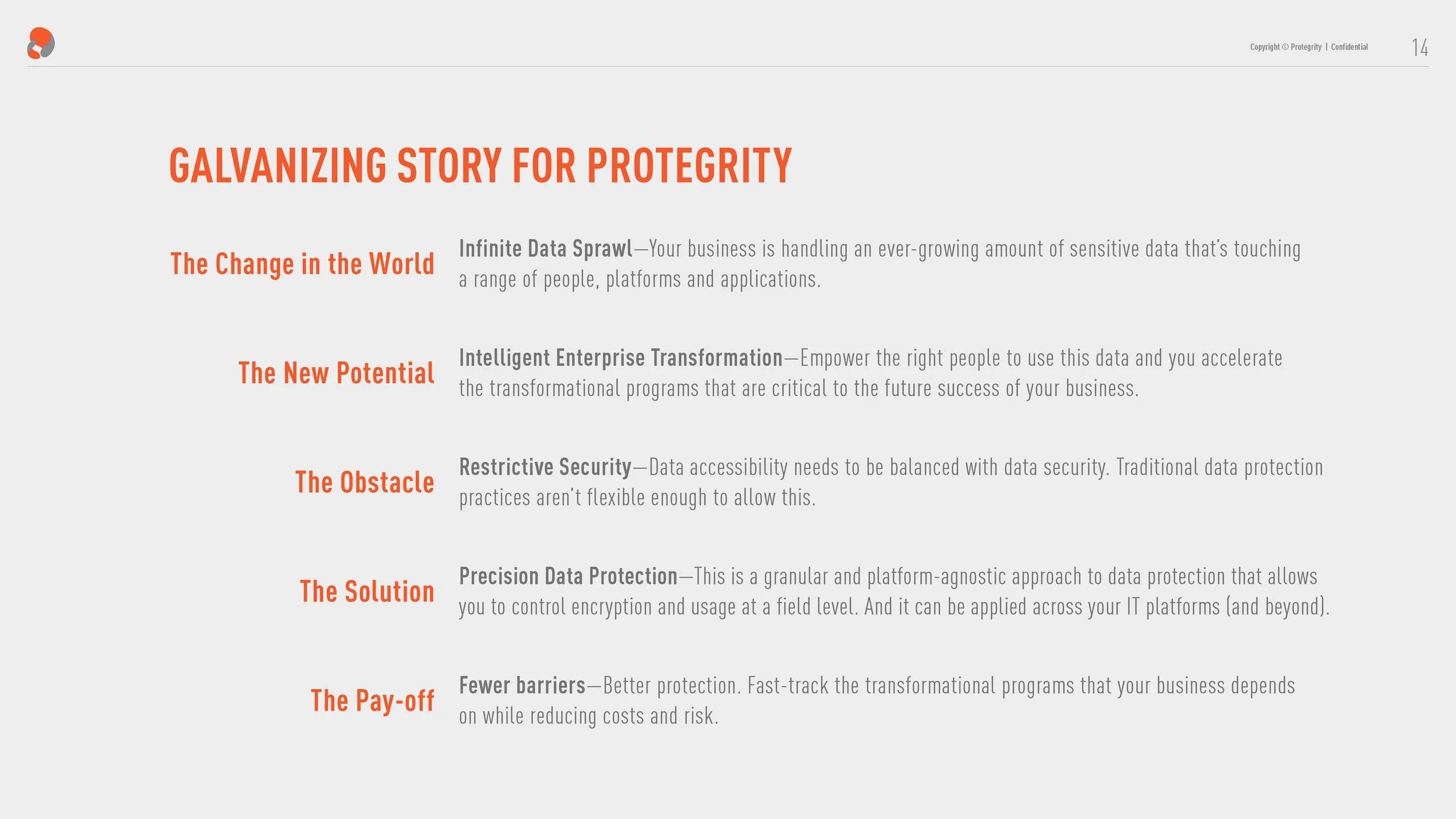
As part of Protegrity’s initial rebrand, we developed updated messaging and go-to-market strategies. To effectively communicate these changes both internally and externally, I designed a pitch deck that applied the new branding, transforming complex information into an engaging and visually compelling experience.




Sound Concepts Info Sheets
Designed collateral for the 2018 Direct Selling Association (DSA) convention to showcase Sound Concepts' capabilities and industry leadership. The materials were crafted to highlight our ability to push creative and strategic boundaries to meet diverse client needs. This project served as a flagship initiative, influencing the company’s broader design direction and setting the foundation for future brand elements.


Disrupt
Developed a suite of sales tools for Disrupt, including flip charts, brochures, banners, business cards, and more. Collaborated with the team to design and assemble a comprehensive kit box for new distributors, ensuring a cohesive and impactful onboarding experience that reinforced brand identity and sales effectiveness.
Weekly Planners
A key responsibility at Sound Concepts was designing specialized weekly planners for some of our largest clients each year. Tailored to the unique needs of their distributors, these planners served as both motivational tools and practical resources to enhance productivity, track goals, and measure success. By combining thoughtful design with functionality, I helped create tangible assets that empowered individuals to stay organized and achieve their business objectives.


BFA Exhibit for BETA
Developed the brand identity and visual style for BETA, a campaign I created to engage outdoor enthusiasts. The campaign debuted in a storefront exhibit, featuring the BETA: Guide to Popular Peaks hiking guidebook and a custom apparel line. This initiative blended experiential marketing with thoughtful design to create an immersive brand experience.


NATIVE APP
Led an extensive UI/UX project for NATIVE, integrating front-end app development with user-centered design. Conducted interviews and user testing within the outdoor and adventure community to optimize usability and functionality. NATIVE fosters community by allowing users to share their trips and experiences while also serving as a safety tool, notifying friends of their whereabouts during outdoor adventures. The design prioritizes both engagement and security, enhancing the overall user experience.


My DOC App Design
For my Independent Study, I developed MY DOC, a streamlined digital system designed to simplify the medical experience. The platform consolidates appointments, prescriptions, insurance details, billing, and medical history into one accessible hub. With a focus on clean design and intuitive navigation, MY DOC enhances usability for all users, making healthcare management more efficient and stress-free.


Weekend Climb Magazine
I have a deep appreciation for crisp, clean design with intentional use of white space, which I worked to achieve in this project. Inspired by Massimo Vignelli, I focused on strong grid structures and distilled the design down to its essential elements—creating a refined, highly functional visual experience.


Petzl RocTrip Poster Series
I aimed to visually capture the essence of these short films by blending organic textures and imagery with geometric shapes—symbolizing the balance between nature and the structured precision of climbing. The interplay of these shapes reflects the dynamic interactions between individuals from diverse cultures, mirroring the shared experiences that unite them.


Live Green Festival Poster
Designed an event poster for the annual SLC Live Green Festival in Downtown Salt Lake City. Inspired by the festival’s focus on innovation and new ideas, I incorporated my technical drafting skills to create a blueprint-style overlay—symbolizing the process of building a more sustainable future. The brushed page effect reinforces the concept of ideas in motion, ready to take shape.
Ebmar Logo Animation
Logo Animation created using Adobe After Effects.
Wilderness Survival
Created a motion graphic in After Effects designed to capture an outdoorsy feel with a touch of humor, while delivering a serious message and call to action. A continuous line guides viewers through the 5 Wilderness Survival Tips, visually connecting the narrative and adding dynamic interaction to the numbered steps—enhancing engagement and storytelling.
Sparrow Eye
Developed the name and wordmark for a company specializing in auditing web-based software. The goal was to create a brand identity that felt approachable—counteracting the typically intimidating nature of auditing—while also symbolizing the synchronization of upper and lower levels of business.
To achieve this, I selected a script font to add warmth and fluidity, seamlessly integrating the words Sparrow and Eye through an elegantly designed 'e,' which also serves as the 'o' in Sparrow. The result is a distinctive and cohesive identity that aligns with the intuitive nature of an app.


The Vault
Developed the brand identity and standards guide for The Vault restaurant, a gourmet burger concept designed to offer a unique dining experience. Each location featured a different curated collection, so I crafted a simple yet versatile brand identity to accommodate this variability.
To reinforce the theme, I incorporated a keyhole element—symbolizing the act of unlocking The Vault to discover rare and curated collections at each location. This approach created a cohesive yet adaptable brand that enhances the restaurant’s distinctive concept.


Type Catalog
Typography Layout and Design


Announcements & Invitations
Designed a diverse range of wedding announcements and invitations, adapting to various styles from industrial wood-cut designs to elegant, formal aesthetics. My versatility allows me to craft invitations that perfectly match any occasion, ensuring a unique and personalized touch for each couple.


Quiet in Alaska
Created with Adobe Illustrator


